Chefs Feeding Kids landing page concepts
This is the current landing page for reference. Click on any image to enlarge it!
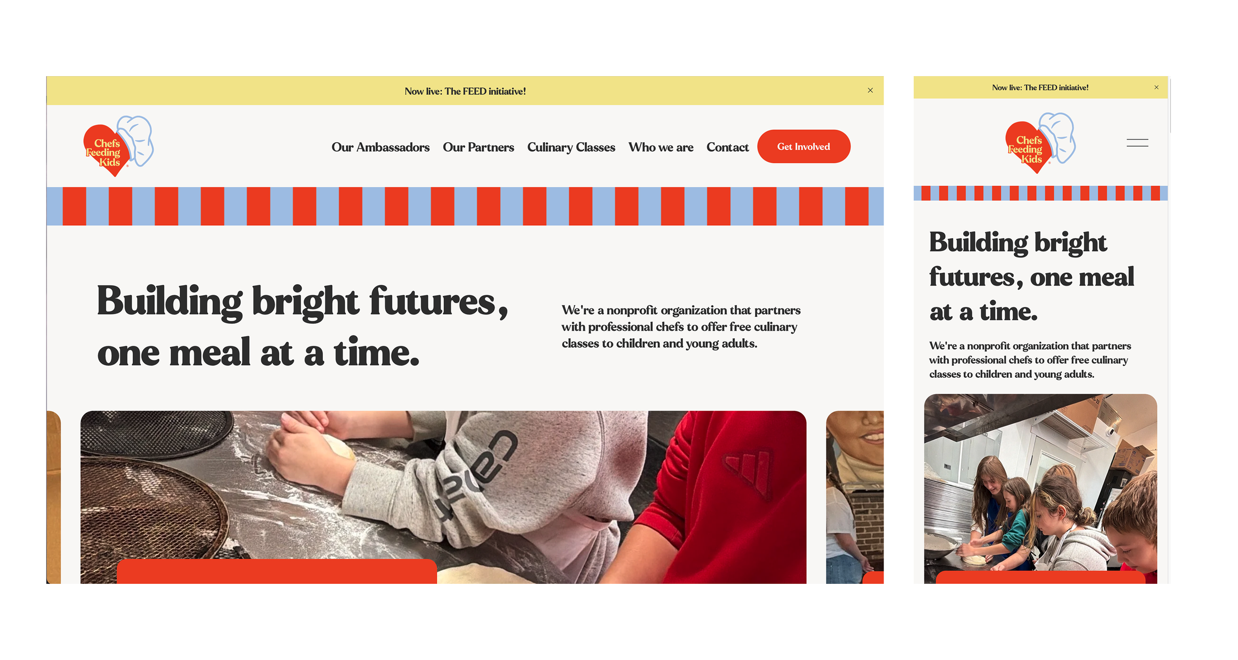
1. Original with doodles
The doodles are placed to lean into the fun and playful feel without getting cluttered. They would be worked into other areas throughout the site for consistency.
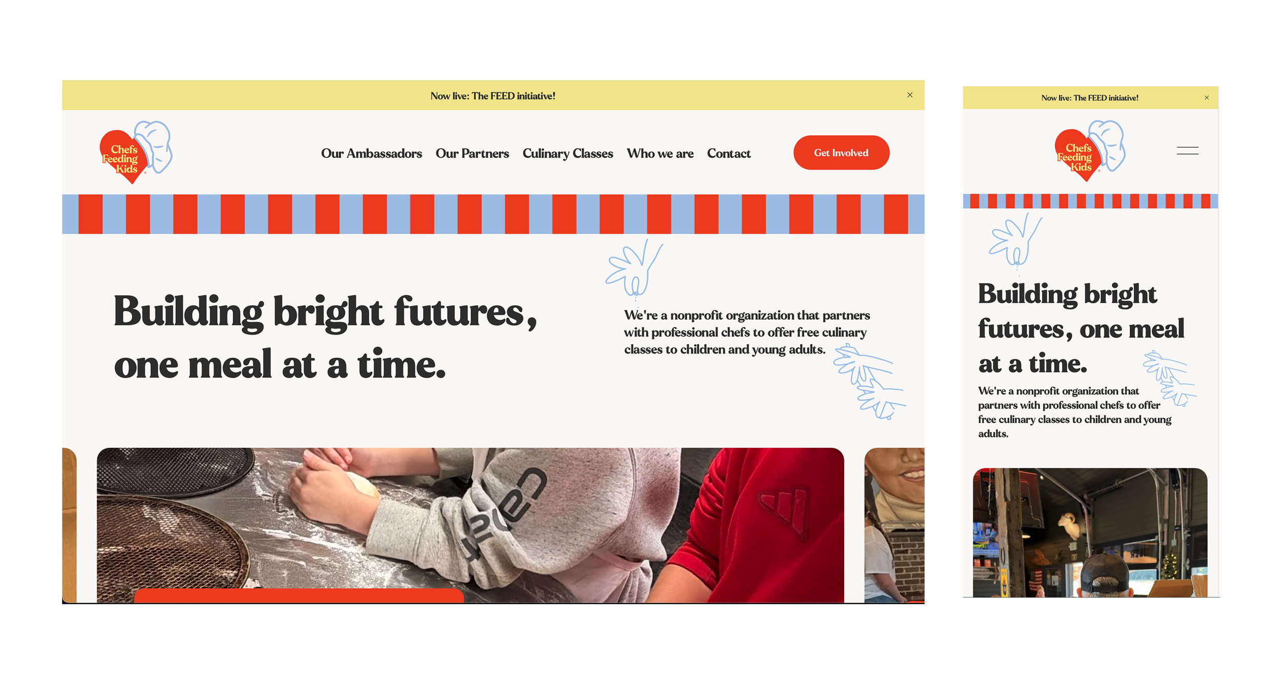
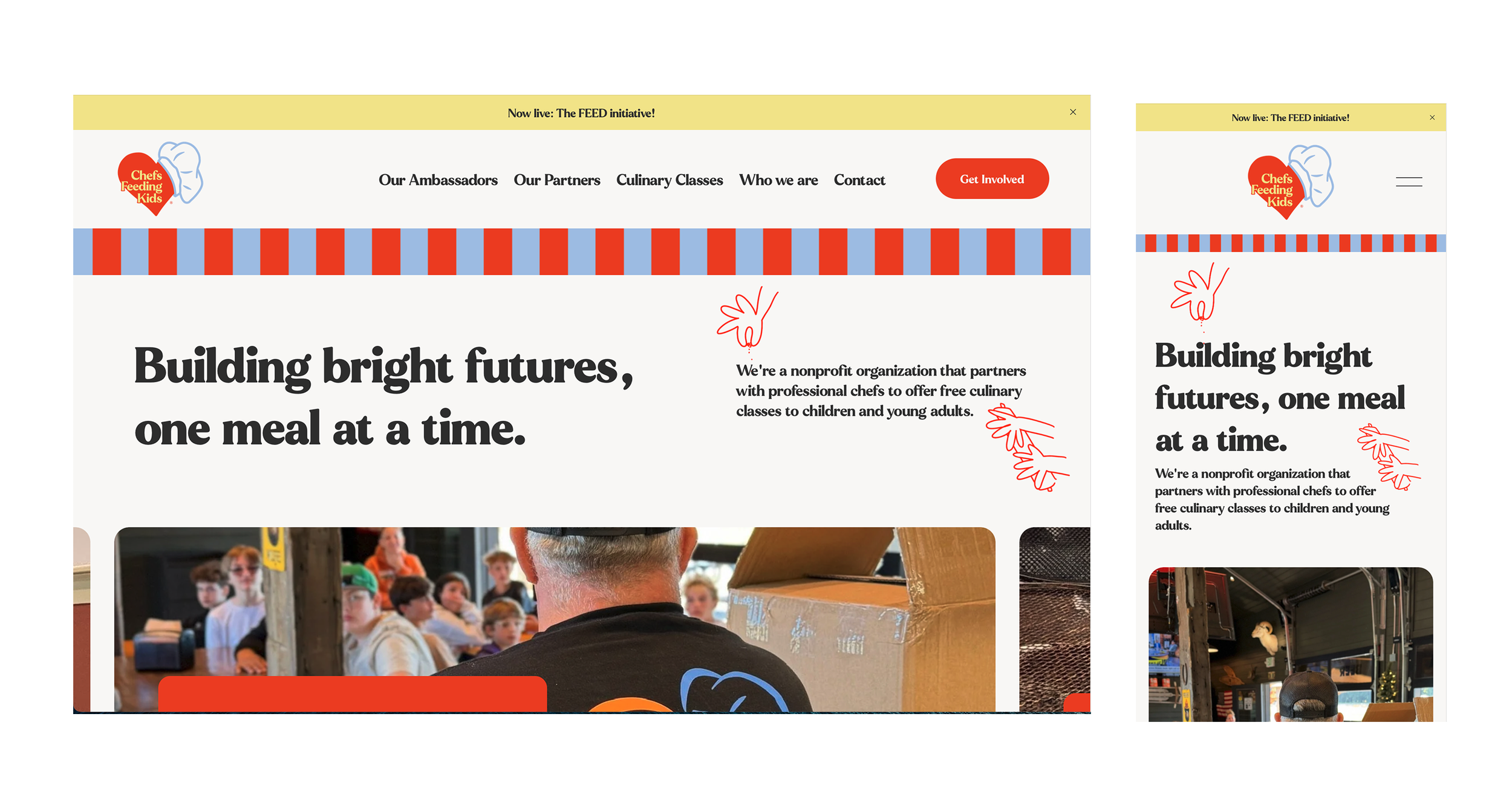
2. Full slideshow
the original headline and statement are now the first slide of the slideshow. This reduces whitespace and makes the page more dynamic while keeping things clean.
Once there are professional photos and videos, utilizing video in this space would be an amazing way to accomplish the goal of making things more dynamic while showcasing both the fun and the work being done!
3 Red background
I wasn’t sure whether it was the whitespace (blank space) or the space that is white that you didn’t like, so I included this option that keeps the whitespace but fills it with color.
Yellow background pattern example
Lastly, I included this example to give a sense of what a yellow doodle pattern background would look like in practice. I am not a fan of this one as think this works against the clean and fresh image we’ve been building towards, but this composition has come up a few times so I wanted to provide this example so everyone can check it out and see what they think.
